Grasshopper
My Role:
My Role:
UX Designer
UX Designer
UX Designer
Client:
Client:
Client:
Grasshopper
Grasshopper
Grasshopper
Duration
Duration
Duration
10 Month
10 Month
10 Month
Team:
Team:
Team:
2 Designers, 1 Product Manager
2 Designers, 1 Product Manager
2 Designers, 1 Product Manager
About this project
About this project
About this project
Grasshopper is a virtual phone product that allows small businesses to maintain professionalism and stay connected by providing dedicated business phone numbers and call management features.
Despite its established presence in the market, Grasshopper's desktop application had become outdated, lacking the modern design and functionality offered by their competitors. Our goal was to help Grasshopper upgrade their core user experience while ensuring a seamless transition for existing customers, preserving the familiarity they valued while enhancing overall usability.
Grasshopper is a virtual phone system that empowers small businesses to maintain professionalism and stay connected by providing dedicated business phone numbers and call management features. Ensuring that businesses and individuals can meet their digital communication needs.
Despite its established presence in the market, Grasshopper's desktop application had become outdated, lacking the modern design and functionality offered by competitors such as Nextiva, RingCentral, and Dialpad. Recognizing the need for a comprehensive redesign, we embarked on a project to revitalize the desktop app. Our goal was to introduce a fresh, contemporary interface that not only attracted new users but also ensured a seamless transition for existing customers, preserving the familiarity they valued while enhancing overall usability.
Objective & Goals
Objective & Goals
Objective & Goals
While working closely with the product manager and company stakeholders, we conducted an in-depth analysis of user feedback and identified several critical challenges within the existing Grasshopper desktop application. Through this collaborative effort, we pinpointed 8 areas for potential improvement. Given the project's scope and timeline, stakeholders prioritized three key areas for enhancement:
While working closely with the product manager and company stakeholders, we conducted an in-depth analysis of user feedback and identified several critical challenges within the existing Grasshopper desktop application. Through this collaborative effort, we pinpointed 8 areas for potential improvement. Given the project's scope and timeline, stakeholders prioritized three key areas for enhancement:
While working closely with the product manager and company stakeholders, we conducted an in-depth analysis of user feedback and identified several critical challenges within the existing Grasshopper desktop application. Through this collaborative effort, we pinpointed 8 areas for potential improvement. Given the project's scope and timeline, stakeholders prioritized three key areas for enhancement:
While working closely with the product manager and company stakeholders, we conducted an in-depth analysis of user feedback and identified several critical challenges within the existing Grasshopper desktop application. Through this collaborative effort, we pinpointed 8 areas for potential improvement. Given the project's scope and timeline, stakeholders prioritized three key areas for enhancement:
Seamless Onboarding
Seamless Onboarding
Guide new users into a seamless introduction to the desktop app
Guide new users into a seamless introduction to the desktop app
Guide new users into a seamless introduction to the desktop app
Competitive Product Offering
Competitive Product Offering
Enhancing usability and accessibility of the desktop and mobile app
Enhancing usability and accessibility of the desktop and mobile app
Enhancing usability and accessibility of the desktop and mobile app
Simplifying User Set Up
Simplifying User Set Up
Empowering users with intuitive control over their preferences
Empowering users with intuitive control over their preferences
Empowering users with intuitive control over their preferences

Seamless Onboarding
Seamless Onboarding
Seamless Onboarding
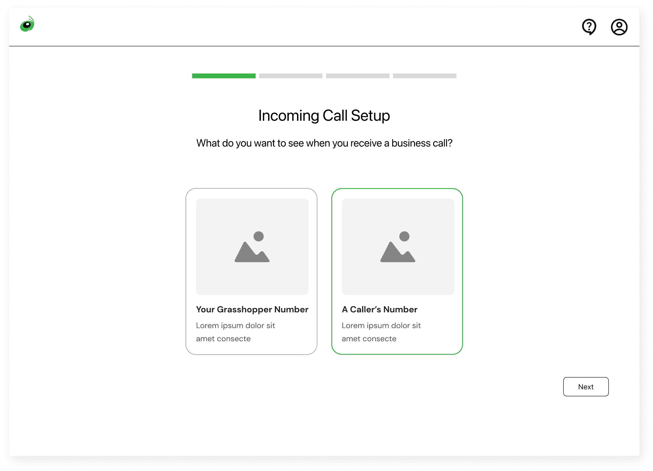
How can we improve the onboarding flow to reduce user confusion and enhance usability for new users?
The current onboarding experience was fragmented, it required users to switch between the desktop app and a web browser while navigating a box-within-a-box design. This complex, multi-step process created unnecessary friction for users with different browser and screen sizes.
Userflow friction points


After a new user opens the app on their desktop, they are directed to the website for onboarding set up.
The "box within a box" design of the onboarding interface results in portions of the form being cut off.
Nested scrolling and concealed steps can lead to user confusion and increased cognitive load.
Onboarding that provides immediate product value
Onboarding that provides immediate product value
To align with business goals of delivering immediate value and providing users with a better experience, we made the following improvements:
Integrated In-App Onboarding- Moving the onboarding process from website to within the desktop app minimizes disruptions and provides a cohesive user experience
Immediate Feature Engagement- Introducing a prompt that encourages users to make a call immediately after setup allows users to experience the app's core functionality firsthand, reinforcing its value proposition.
To address the challenges in Grasshopper's onboarding process and align with business goals of delivering immediate value, we made the following improvements:
Integrated In-App Onboarding: We transitioned the onboarding process from an external website to within the desktop application. This approach minimizes disruptions and provides a cohesive user experience, allowing new users to become familiar with the app's environment from the outset.
Immediate Feature Engagement: Recognizing the importance of early value realization, we introduced a prompt that encourages users to make a call immediately after setup. This hands-on approach allows users to experience the app's core functionality firsthand, reinforcing its value proposition.
These enhancements aim to create a seamless onboarding journey, reducing friction and enabling users to quickly grasp and utilize Grasshopper's essential features.

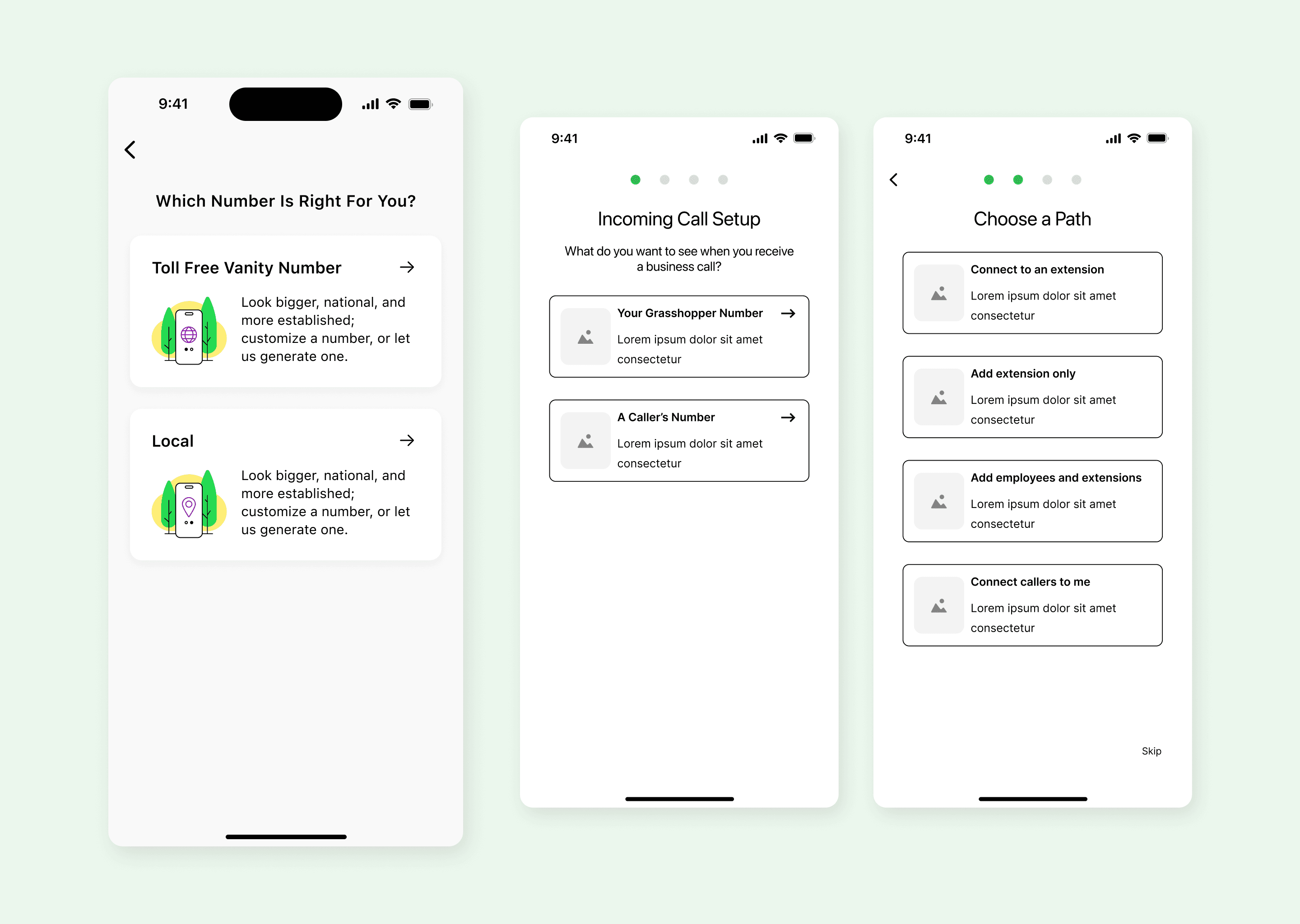
Integrated in-app onboarding
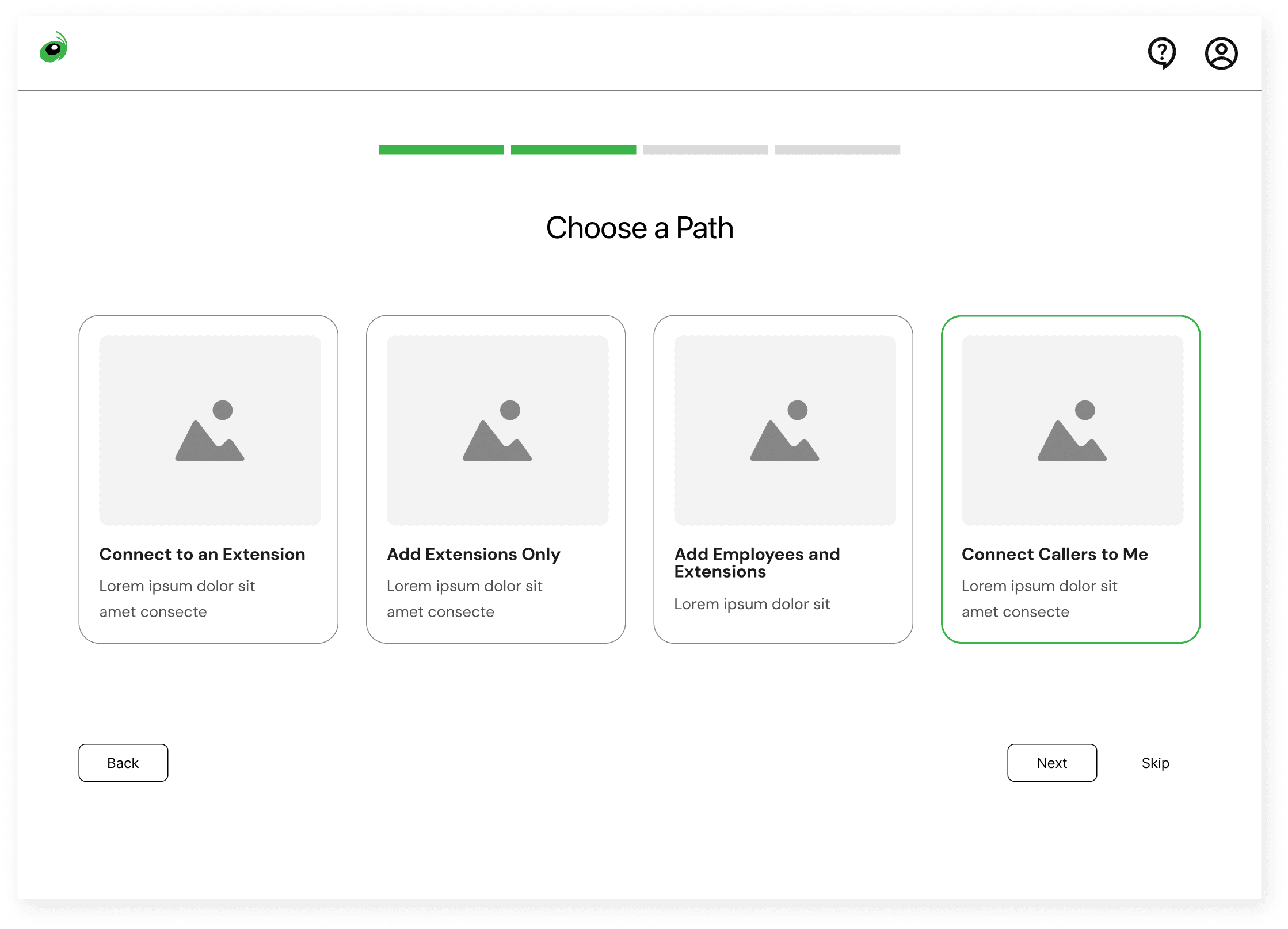

Users are shown a progress bar to know relative location of the flow
Utilizing the open spacing of the desktop app allows clear selections and provides the ability to include visual context
This provides more space for input forms, eliminating cut-offs and allowing users to view details at once
This provides more space for input forms, eliminating cut-offs and allowing users to view details at once
Enhancing the mobile experience
Enhancing the mobile experience
Enhancing the mobile experience
To create a consistent and intuitive experience across all platforms, we extended our redesign to the mobile app.
This ensured that business communications remained uninterrupted and professional, whether users were at their desks or on the move.
To create a consistent and intuitive experience across all platforms, we extended our redesign to the mobile app.
This ensured that business communications remained uninterrupted and professional, whether users were at their desks or on the move.
To create a consistent and intuitive experience across all platforms, we extended our redesign to the mobile app.
This ensured that business communications remained uninterrupted and professional, whether users were at their desks or on the move.
To create a consistent and intuitive experience across all platforms, we extended our redesign to the mobile app.
This ensured that business communications remained uninterrupted and professional, whether users were at their desks or on the move.
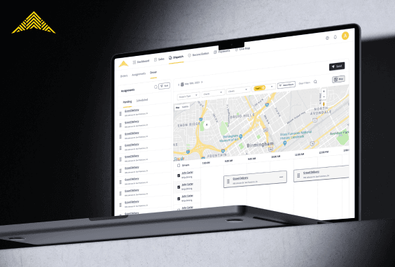
Competitive Product Offering
Competitive Product Offering
Competitive Product Offering
How might we redesign the dialer interface and navigation to improve daily workflows?
We learned that current users of the app felt limited by the features that it offered, while new users found it difficult to find the necessary tools they needed. Upon further discovery, we learned that the app had already provided many of the features users were missing out on.
Old dialer app
Old dialer app
Old dialer app
The old dialer app is a simple looking prduct with clean design. Emtpy space could be better utilized for essential features like call history, or contact search.
Our redesign should focus on improving layout efficiency, navigation clarity, and highlighting key interactions.
The old dialer app is a simple looking prduct with clean design. Emtpy space could be better utilized for essential features like call history, or contact search.
Our redesign should focus on improving layout efficiency, navigation clarity, and highlighting key interactions.
The old dialer app is a simple looking prduct with clean design. Emtpy space could be better utilized for essential features like call history, or contact search.
Our redesign should focus on improving layout efficiency, navigation clarity, and highlighting key interactions.
The old dialer app is a simple looking prduct with clean design. Emtpy space could be better utilized for essential features like call history, or contact search.
Our redesign should focus on improving layout efficiency, navigation clarity, and highlighting key interactions.
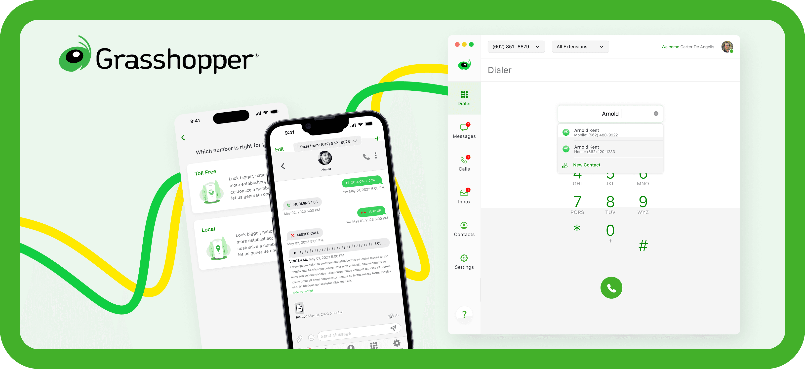
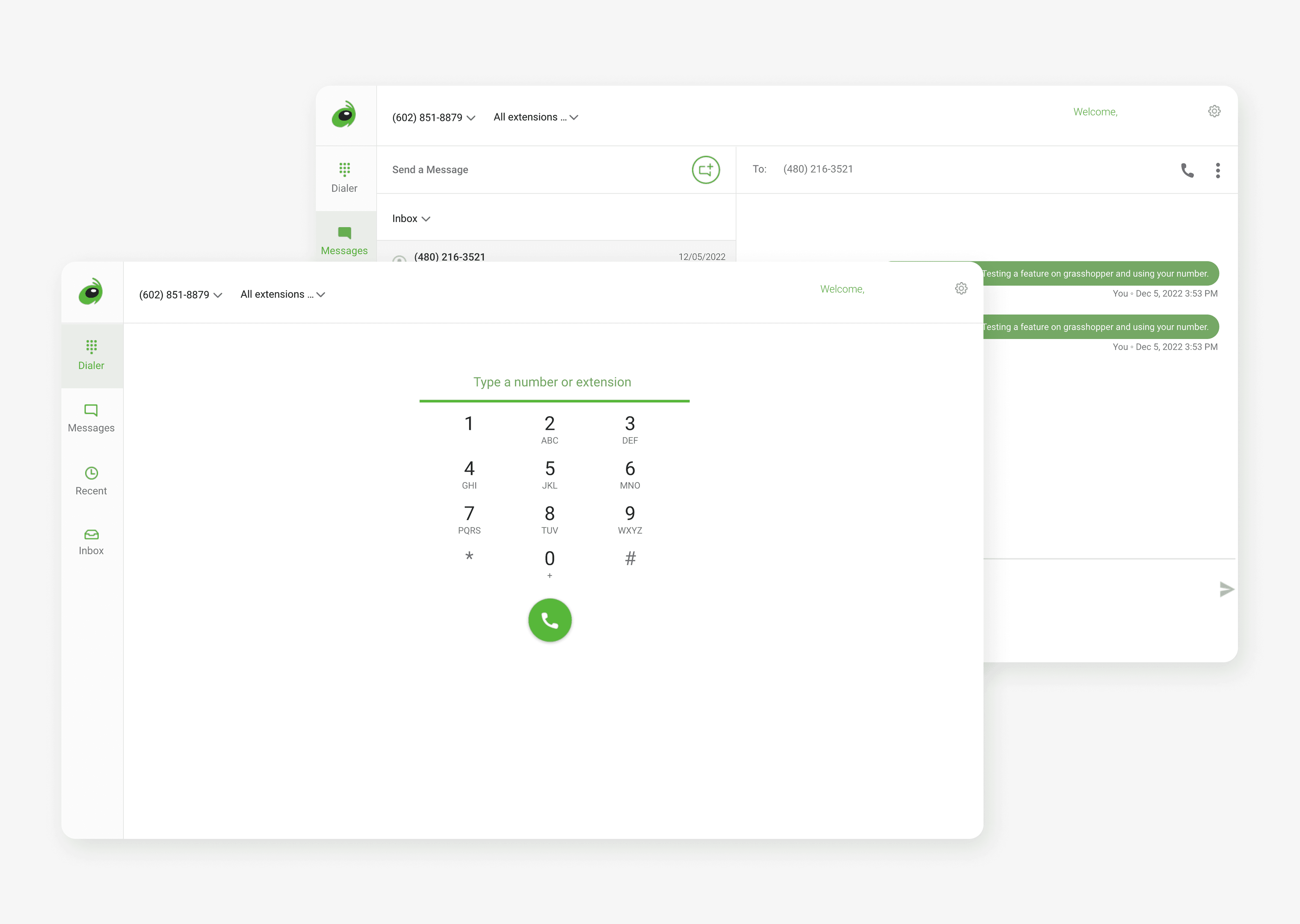
A modern product with improved accesibility
A modern product with improved accesibility
A modern product with improved accesibility
We proposed two new layouts that improve usability, efficiency, and navigation clarity. Both concepts introduce an easier way to access the key "Make a Call" function.
The first design is a search-first approach, enabling users to quickly find contacts, while the second layout prioritizes a prominent "Make a Call" button, ensuring fast access to the dialer.
We proposed two new layouts that improve usability, efficiency, and navigation clarity. Both concepts introduce an easier way to access the key "make a call" function.
The first design is a search-first approach, enabling users to quickly find contacts or call history, while the second layout prioritizes a prominent "Make a Call" button, ensuring fast access to the dialer. By refining the information hierarchy and reducing visual clutter, our redesign makes calling, messaging, and managing contacts more intuitive, efficient, and aligned with users’ daily workflows.

Refining the design through user feedback
After presenting our initial designs to stakeholders, the Grasshopper team worked with their current users to gain insights into how they would interact with the new design. It was here that we encountered pushback that highlighted gaps in our understanding of the core users.
We identified key usability concerns and refined our design to balance modernization with familiarity. In our revised design, we maintained user familiarity by retaining the original dialer design, while adding additional search functionality to that design. Through this iterative process we learned the importance of maintaining current user experience while updating for an improved experience for new users.
After presenting our initial concepts to stakeholders, the Grasshopper team conducted user interviews with their current users to gain insights into how they would nteract with the new design. It was here that we encountered pushback that highlighted gaps in our understanding of the core users.
We identified key usability concerns and refined our design to balance modernization with familiarity. The updated version (shown above) retains the core dialer functionality users rely on, while improving navigation, accessibility, and clarity. This iterative process ensured that our redesign not only aligned with user needs but also resonated with stakeholders, leading to a more thoughtful and impactful product update.

Optimizing messaging

In addition to modifying the dialer experience, we also focused on updates to the messaging flow.
Integrated Calling Actions – Embedding call options directly within message threads, allows users to seamlessly pick-up a conversation based on different circumstances.
In-Progress Call Overlay – This allows users to move freely around the app while on a call, providing necessaty call context and access to quick actions.
In addition to modifying the dialer experience, we also focused on updates to the messaging flow.
Integrated Calling Actions – Embedding call options directly within message threads, allows users to seamlessly pick-up a conversation based on different circumstances.
Improved Message Composition – A clearer layout for composing messages ensures a more natural and responsive texting experience.
Compact Call Overlay – While on a call, users can continue messaging without disruption, thanks to a floating call UI that provides essential controls without taking up unnecessary space.
These refinements help business owners and teams stay connected effortlessly, ensuring their communications—whether by call or text—feel fluid, organized, and easy to manage.
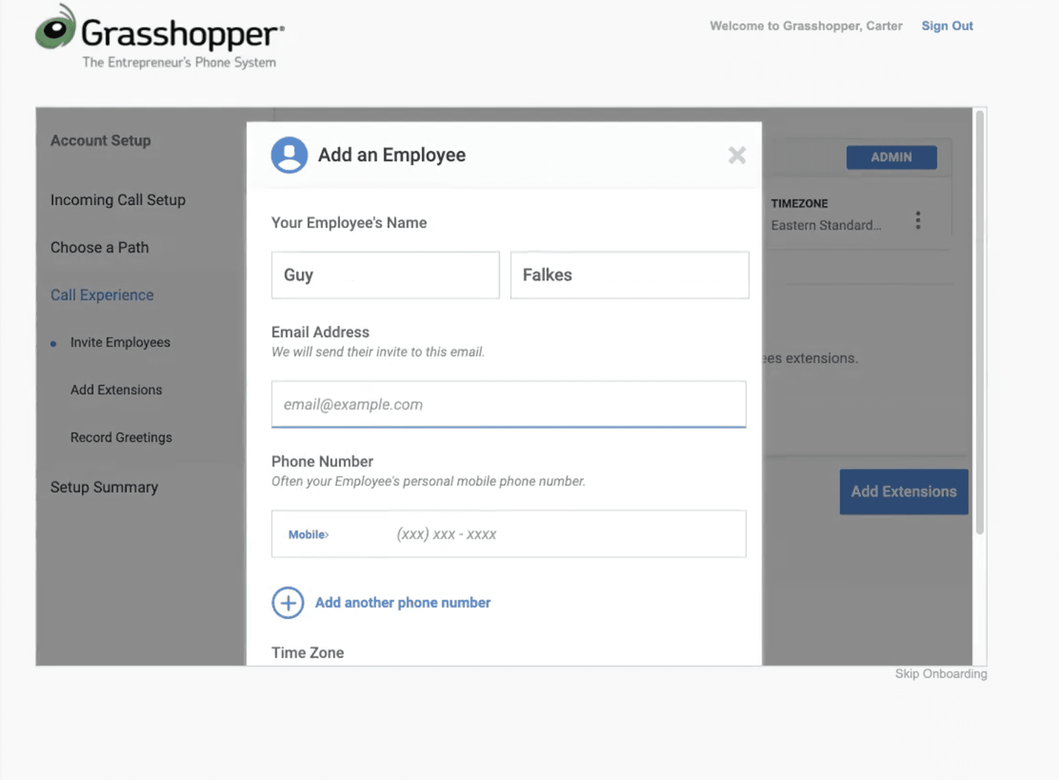
Simplifying User Set Up
Simplifying User Set Up
Simplifying User Set Up
How might we centralize user settings to reduce user fatigue?
For a virtual phone system, settings is one of the most important functions that isn't quite obvious from a glance. However, this was essential especially for businesses who relied on custom call settings for their daily customer service.
Outdated and segmented settings

The NUUI settings required users to log in to an external portal on the Grasshopper website to manage. The disconnected experience made it harder for businesses to quickly update preferences, leading to a lack of flexibility in managing their communication needs.
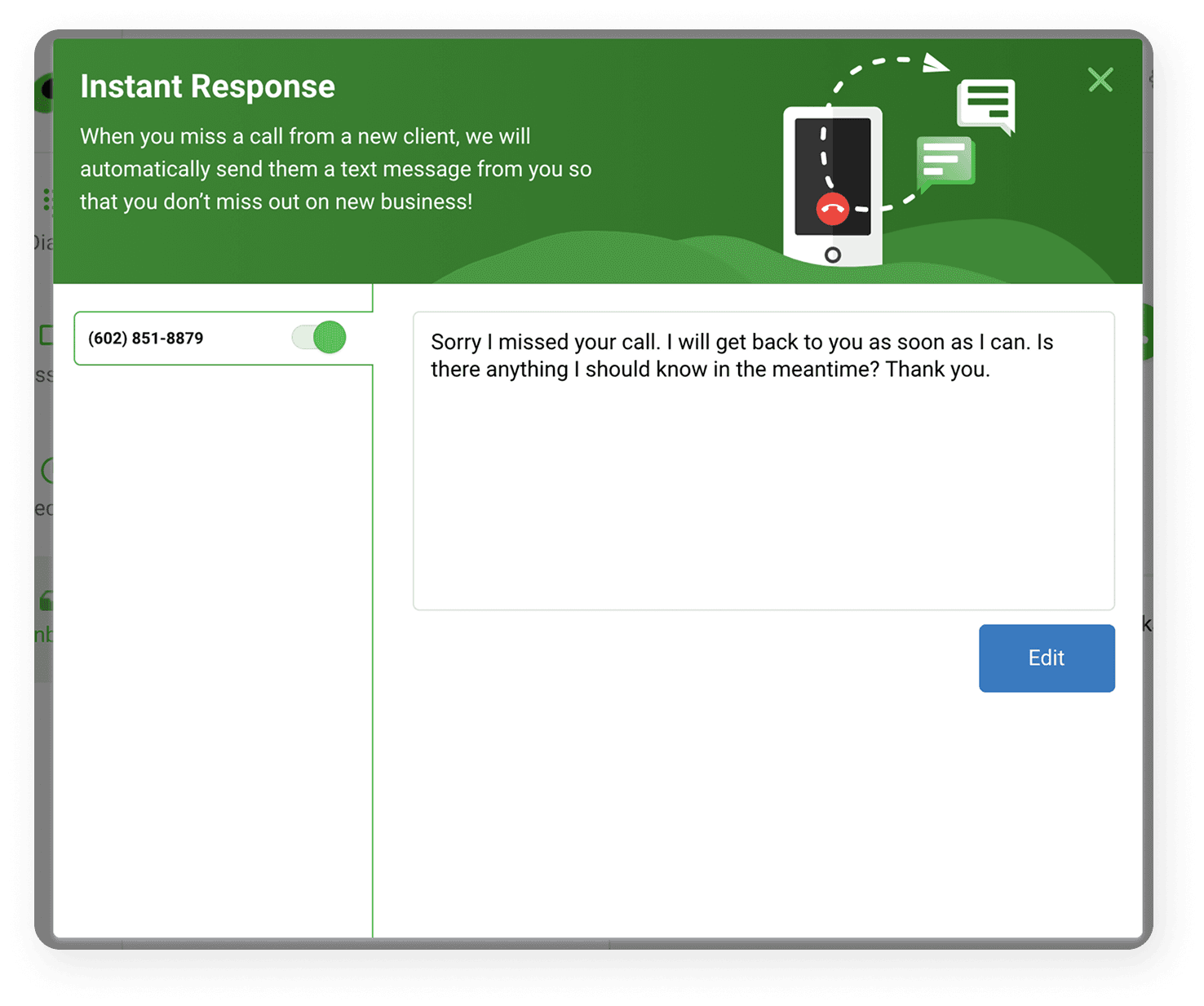
The only in-app configuration available was Instant Response, while all other key settings (call routing, voicemail preferences, and account management) were on the Grasshopper website. This forced users to leave the app, which disrupted their workflow.
The only in-app configuration available was Instant Response, while all other key settings (call routing, voicemail preferences, and account management) were on the Grasshopper website. This forced users to leave the app, which disrupted their workflow.
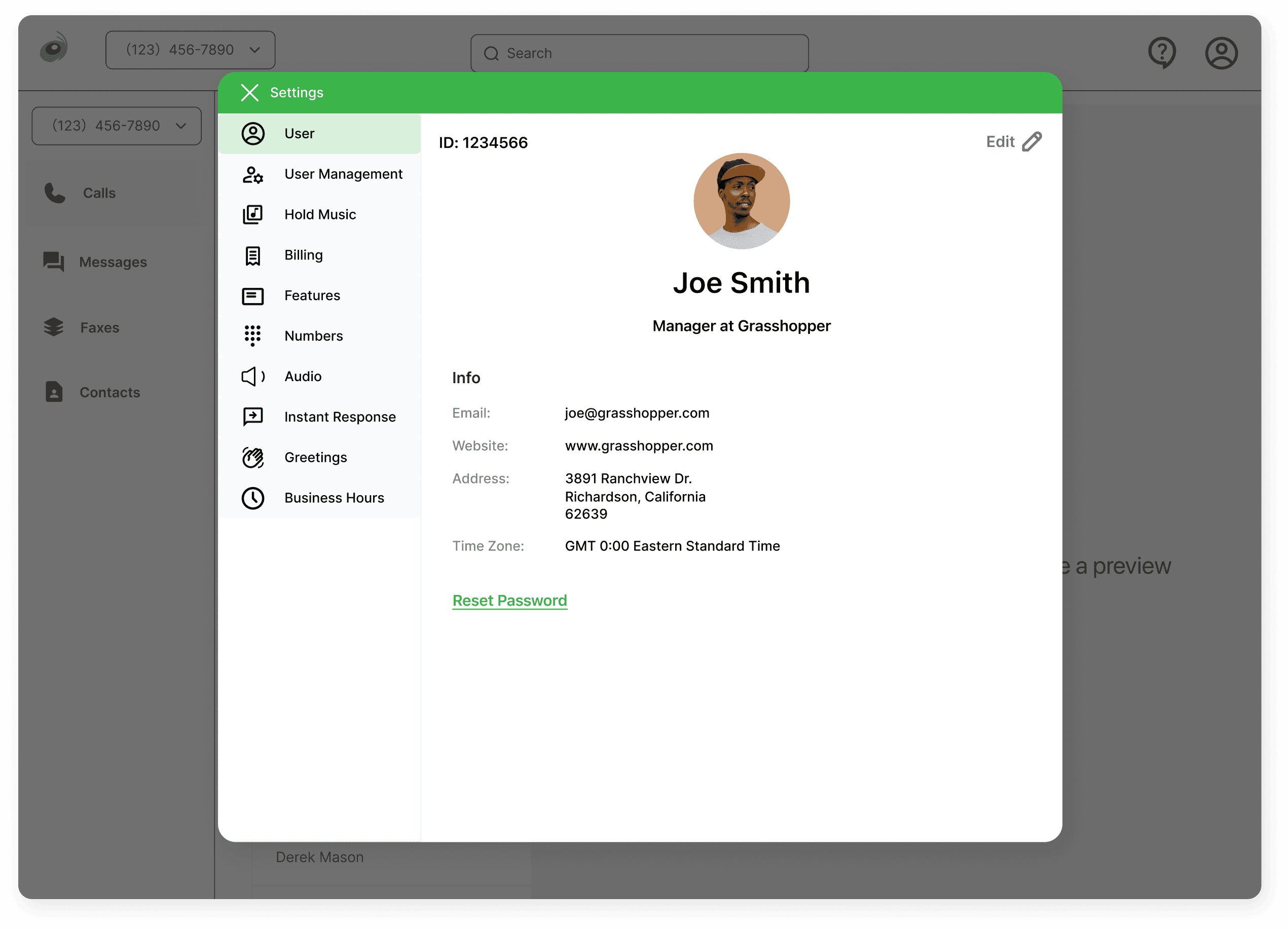
Unified settings
Unified settings
Unified settings
In our updated design, all essential settings configurated into a single modal that popped up as an overlay inside the app.
We abandoned the double top menu from the NUUI settings and introduced a side navigation, which provides more clarity and enough familar usasbility for users.
In our updated design, all essential settings configurated into a single modal that popped up as an overlay inside the app.
We abandoned the double top menu from the NUUI settings and introduced a side navigation, which provides more clarity and enough familar usasbility for users.
In our updated design, all essential settings configurated into a single modal that popped up as an overlay inside the app.
We abandoned the double top menu from the NUUI settings and introduced a side navigation, which provides more clarity and enough familar usasbility for users.
In our updated design, all essential settings configurated into a single modal that popped up as an overlay inside the app.
We abandoned the double top menu from the NUUI settings and introduced a side navigation, which provides more clarity and enough familar usasbility for users.

Customizing hold music per number
Customizing hold music per number
Customizing hold music per number
With clear expandable sections and intuitive dropdowns, users gain more control and flexibility over their phone system.
In the new layout, we eliminated unused empty space that was creating visual fatigue.
With clear expandable sections and intuitive dropdowns, users gain more control and flexibility over their phone system.
In the new layout, we eliminated unused empty space that was creating visual fatigue.
With clear expandable sections and intuitive dropdowns, users gain more control and flexibility over their phone system.
In the new layout, we eliminated unused empty space that was creating visual fatigue.
Manage business hours for call routing
Manage business hours for call routing
Manage business hours for call routing
The redesigned Buisness Hours page provides an expandable structure that makes it easy to customize availability for each day of the week.
By keeping everything in one place, users can make adjustments with minimal efforts. This enables businesses to provide the best customer service for their clients, even in times of sudden change.

Balancing innovation with familiarity
Balancing innovation with familiarity
Balancing innovation with familiarity
When we first began this project, our team was excited to enhance a product integral to the daily operations of numerous users. We wanted to create a unique experience, that would elevate Grasshopper's product identity forward. However through user testing and feedback, we realized the importance of maintaining familiarity and creating a smooth transition for existing users.
Our improved design introduced key functions into the app, creating a better experience for managing business communications, while honoring the product's core usability to ensure our udpates would not create more frustion to a users daily workflow.